
Original digital typeface designs by Arthur Durkee
-

Letterpress Printing
-

Artwork and Painting
-

Graphic Design for Print
-

Illustration
-

Music Design & Illustration
-

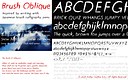
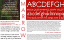
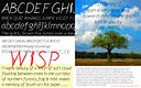
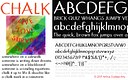
Typeface Design
-

Fine Art Photography
-

Green Man: poetry chapbooks & prints
-

Scattered Leaves: Poetry Chapbook
-

Five Stone Garden
-

Embrace: Prints & chapbook
-

Design Process: "Naked Man"
-

Design Process: LGBT poetry event
-

Design Process: Silverwood Art Installation
-

Brushwork & Calligraphy
-

Spiral Dance
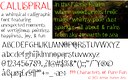


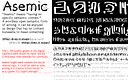
Every so often I find myself taking up my brush pen and drawing an alphabet of asemic glyphs and patterns in my art journal. Usually that takes up a whole page and is lot of design pattern fun. I had the wild idea to create an asemic digital font. Just to be a bit chaotic.
Asemic writing is without specific semantic content. It looks like writing, or calligraphy, on the page, but it doesn't convey linguistic meaning. You can enjoy it purely as a text-like design element, or you can assign your own meaning to it. As with calligraphy or typography, the style of writing can affect mood. Regardless, the vacuum of meaning in asemic writing is for the reader to interpret, or to fill in for themselves. Text becomes pure design, pure imagery.