
Original digital typeface designs by Arthur Durkee
-

Letterpress Printing
-

Artwork and Painting
-

Graphic Design for Print
-

Illustration
-

Music Design & Illustration
-

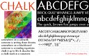
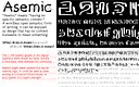
Typeface Design
-

Fine Art Photography
-

Green Man: poetry chapbooks & prints
-

Scattered Leaves: Poetry Chapbook
-

Five Stone Garden
-

Embrace: Prints & chapbook
-

Design Process: "Naked Man"
-

Design Process: LGBT poetry event
-

Design Process: Silverwood Art Installation
-

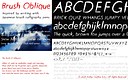
Brushwork & Calligraphy
-

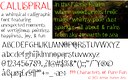
Spiral Dance

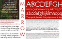


This typeface was created originally as an exercise: imagine type design 500 years into the future. The letterforms will have changed, the orthography of the language will probably have changed. Based on and in homage to the geometric purism of Futura, Futurian adds futuristic (Futura-istic) elements, especially geometrically extended risers and descenders. The intent is for the typeface to appear angled and geometric close up, but to have the forms created by the extended line elements look organic: like a line of trees, each of which is made of pure geometry but which give an overall organic feel.
Futurian has been used for online and print applications multiple times, primarily for display and header typography.