This gallery shows the complete process of marketing for concerts of the full-scale male chorus piece "Naked Man," words by Philip Littell, music by Robert Seeley. The music and words were taken from interviews by the writer and composer with members of the gay community in San Francisco in 1996, and the title refers to the emotionally "naked" stories of the lives of gay men at that time. The concert featured chamber orchestra and two combined choruses.
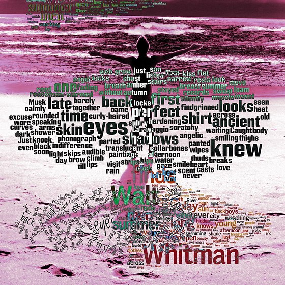
The marketing began a full six months before the concerts, and included logo design, weekly "teaser" photographic ads featuring excerpts from "Naked Man" using members of the chorus as models. I led the design team, was the photographer, and created the performance event logo. We also made t-shirts based on the logo and design, which were worn by the singers during the performance.


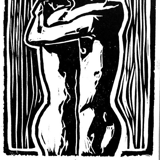
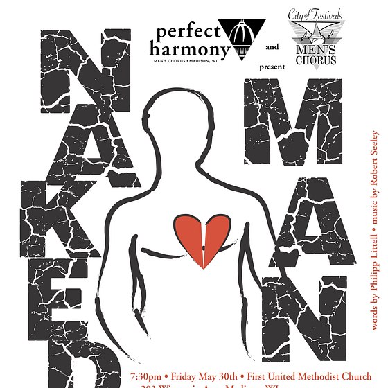


The logo design process went through a few stages before at this final version of the logo, seen here in both positive and reversed versions. The final version of the logo was more or less what I had envisioned, but I had to find the proper "ruined" typeface to underline the mood of damage and vulnerability, and then to layout the image and type in the most effective way. This typeface was heavy enough to create a solid impression and be visible from a distance. The image of the man with the open, broken heart was drawn using a brush pen and traced in vector in Illustrator, where the heart was also drawn freehand.
The resulting final logo was used, in either positive or reversed versions, on every marketing piece, every ad, every publicity material, and on the t-shirts worn by the chorus members during the performances.