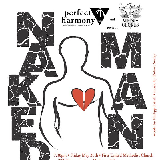
This gallery shows the complete process of marketing for concerts of the full-scale male chorus piece "Naked Man," words by Philip Littell, music by Robert Seeley. The music and words were taken from interviews by the writer and composer with members of the gay community in San Francisco in 1996, and the title refers to the emotionally "naked" stories of the lives of gay men at that time. The concert featured chamber orchestra and two combined choruses.
The marketing began a full six months before the concerts, and included logo design, weekly "teaser" photographic ads featuring excerpts from "Naked Man" using members of the chorus as models. I led the design team, was the photographer, and created the performance event logo. We also made t-shirts based on the logo and design, which were worn by the singers during the performance.
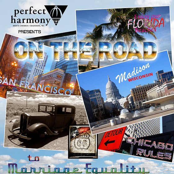
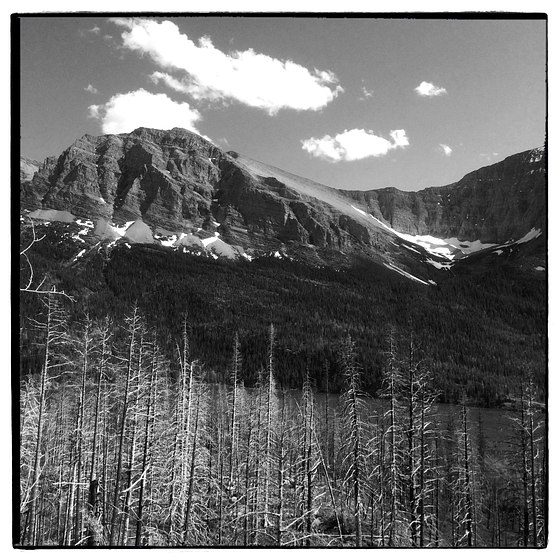
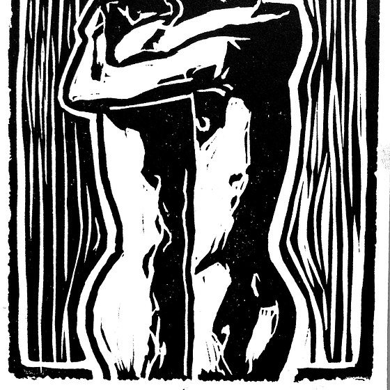
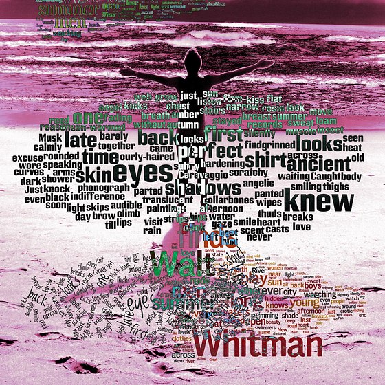
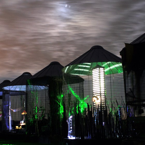
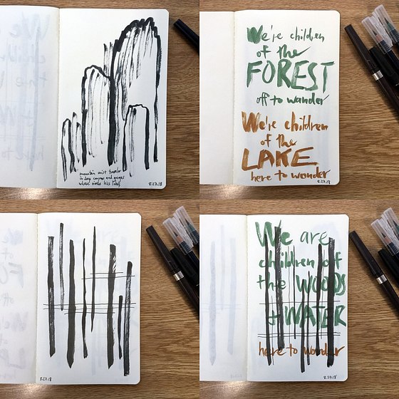
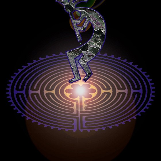


Here is a second selection of ads made for "Naked Man," featuring men from the chorus.
There were four photo shoots over the course of a few months, which were combined with words taken from the lyrics of "Naked Man," using the color swatches established for the marketing campaign. The ads were released once a week for 22 weeks leading up to the concert. The use of quotes from the lyrics was a teaser for the contents of the show itself, to give the audience a preview.
For the text copy for the song lyrics, I chose a typeface that reflected the type standards of the London Underground: a slightly modernistic sans serif "public notice" typeface. Most viewers don't consciously notice the effect that type has on the contents of the message, but it's there.